Hybrid interaction
BrunnsHunt
A location-based experience for children, meant to ease the move to a new place.
A project with
Julia Brandt, Thanita Thapphasut, Anna Wahl
In collaboration with
Lund Municipality
What we did
problem framing, concept development, interaction design,
digital
prototyping, visual design, video
prototyping, user testing
My role
interaction designer, digital prototyper, visual designer (companion app)
Background
Brunnshög is a new part of Lund, being built from scratch on the northeastern side of the city. With international research facilities rising alongside housing, office and commercial space, 40,000 people are thought to live and work over the neighbourhood’s 225 hectares by 2030.
Our brief from Lund Municipality was quite loose: to come up with a concept and a prototype for an interactive experience relating to Brunnshög in some way.
Process
After visiting the site, and discussing possible directions, our group decided to concentrate on potential residents – and children in particular, since their point of view seemed overlooked.

With no time for research, we were left to draw on our own childhood experiences of moving to a new place. By the time I was 9, I had lived in six cities in three countries; another member of the group had relocated from Southeast Asia to Sweden when she was 10.
Based on our stories, we formulated a few assumptions:
- Moving place can be exciting for children, but it can also be disruptive.
- Getting children to move around physically in the new area can make them feel more at home, replacing disruption with engagement and a sense of ownership.
- Less concerned with things that lie years ahead, children are focused on the here and now.
- Children aged 12 and up have their own mobile phones, which could be embraced – if we’d manage to keep participants from being glued to their screens.
The brief asked if the “physicality of the actual site” could play a role in the project. We believed that it should, but also noted that – here and now – the green areas surrounding Brunnshög presented more opportunities for exploration than the neighbourhood being built.
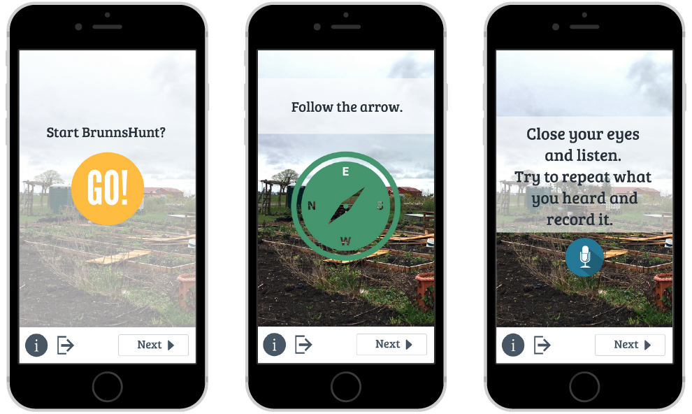
To get children to move around, we tried to come up with different ways that the phone’s sensors and capabilities could be used to interact with the physical environment. For reference, we looked at the outdoor exercises put up by the Swedish Society for Nature Conservation, the augmented reality game Pokémon GO, and the situationist practice of the dérive, a strategy of exploring the landscape which accentuates playfulness and “drifting”.

Making ideas tangible through storyboards and paper prototypes, we arrived at something in between a quiz, an obstacle course, and a treasure hunt. By proposing open-ended challenges – with no “right” or “wrong” or “undo” – we hoped to support a playful atmosphere, where spontaneity and accidents are encouraged.
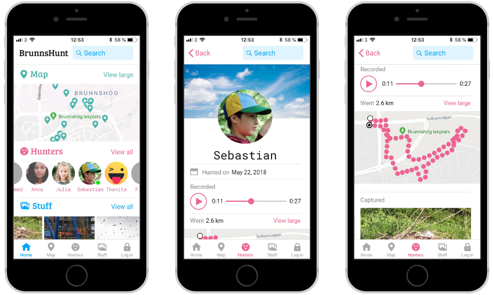
If we could prompt the participants to document and share their experience, this material might serve both as a memory for them, and an entry point for others.


Feedback
We tested the digital prototype with two children, aged 10 and 12. Its limited functionality meant that one of us had to be present and explain what to do – a circumstance that could possibly skew the results. Still, what we learned was helpful, giving both concrete pointers (“they know how to use a compass”, “they don’t understand the exclamation mark on the screen”), and a better understanding, in general, of how children think and behave in this context.
It also made us even more aware of how valuable it would have been to get a grasp of what it means to be 12 years old, before developing the concept. Designing for children was much trickier than we had thought; starting out with some rudimentary research could have allowed us to base our work on insights, rather than assumptions.
Our video prototype was well received by representatives from Lund Municipality. They appreciated the balance between the digital experience and the experience of place, and how we invited, in their words, “the making of new geographies”.
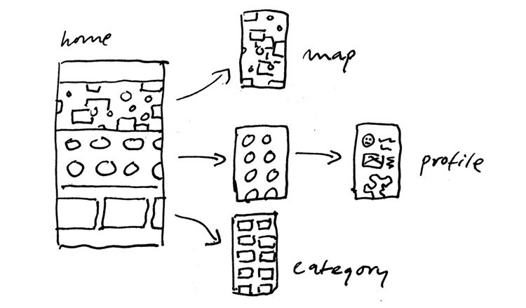
During presentation, someone asked if the companion app was an attempt at creating a kind of social network for children. That had not been our intention – nor had the companion app been our main focus, really – but the question was grounded, and pointed to an issue we had passed by.
When thinking of tracking and displaying the whereabouts of children running around in the woods, we should have paid closer attention to matters of privacy and security, and possible social implications – perhaps by letting the participants be more anonymous.