Mobile interface
One-handed calculator
Prototyping a gesture-based mobile app for calculations on the go.
What I did
concept development, interaction design, digital prototyping, visual
design, user testing
Brief
How could mobile apps be redesigned for easier use with one hand only? What kind of interaction would be less disruptive while on the move?
The brief for this one-week prototyping project suggested two possible areas to explore: the relation between screen size and reach of fingers, and the demands of different interaction patterns on finger dexterity.
Importantly, the assignment required using a widely available digital prototyping tool – one where you drag and drop rather than write code, that is.
With this in mind, I chose to rework a familiar calculator app.
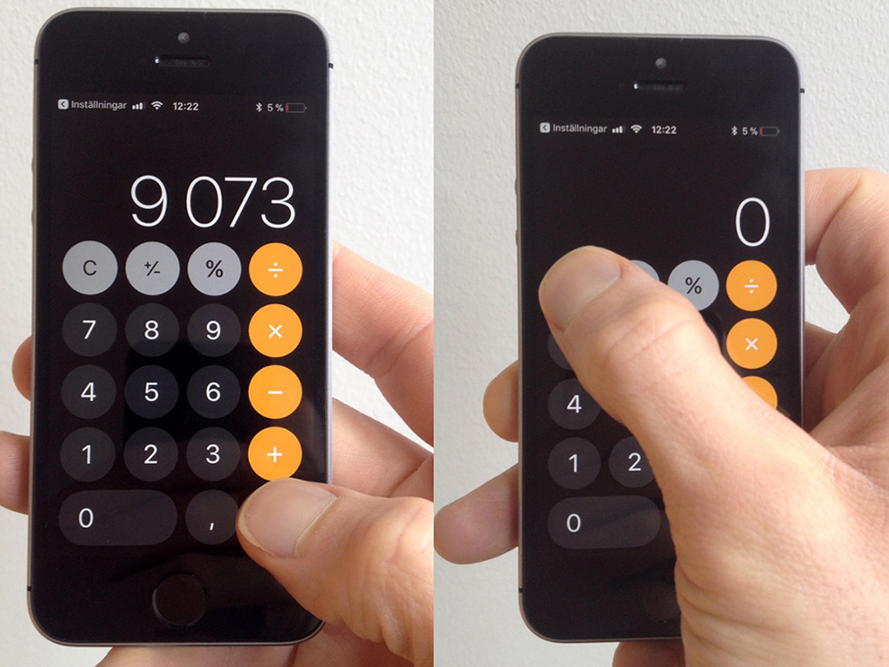
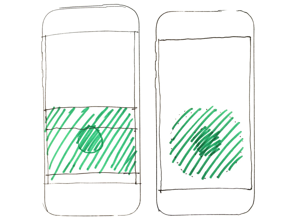
Scrapping the buttons
Based on my own experience, and talking to friends and family, I made the assumption that the most common interaction flow for the calculator is:
- enter first number
- choose operator
- enter second number
- hit “equals to”
Only one person said they used the button, and no one I talked to used the button, or accessed the advanced options by flipping the phone to landscape mode. For calculations on the go, the essentials then seem to be:
- ten digits and a comma
- five operators
- “clear” and “all clear”
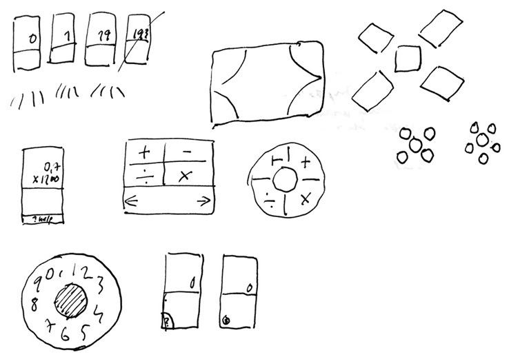
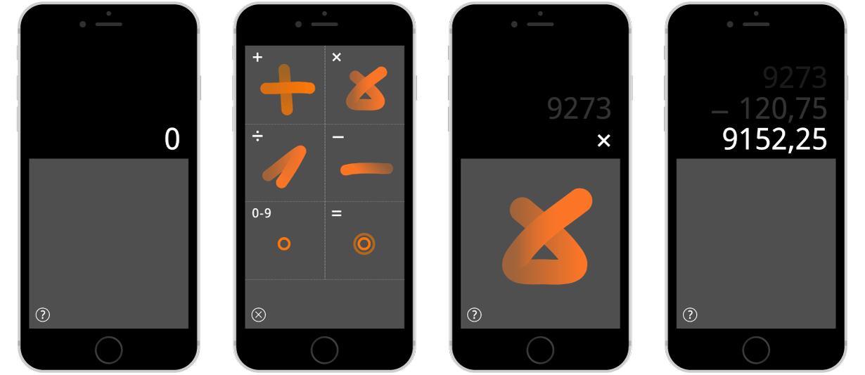
One solution, I thought, to avoid having 18 buttons on the screen, might be to scrap the buttons altogether. A gesture-based interface could allow people to use a smaller part of the screen, while still offering the same functions. The space freed up by removing the buttons could hold something useful that is missing today – a view of numbers entered earlier.
As part of research, a classmate and I tried out two existing calculator apps – Rechner and Sums – that use gestures for entering operators, while numbers are entered through regular on-screen buttons. We found swiping across the buttons an awkward experience, as there was a sense of conflict between the two modes of input.
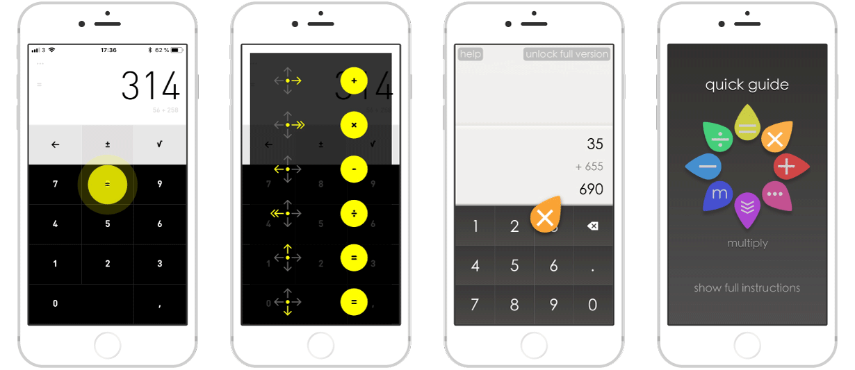
Having realised that most digital prototyping tools support a similarly narrow range of predetermined interactions, I picked one tool that was free, and decided to see how far I could go, attempting to prototype something outside of those conventions.

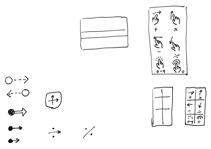
Think aloud testing
I tested the digital prototype on two classmates, sitting next to them, and partly explaining what to do. They were asked to use one hand only. Unprompted, they thought aloud while testing, and we also talked immediately afterwards.
I was curious:
- How easy is it to remember the gestures? Are they distinct enough?
- Will people use the guide? Is it helpful?
- How is this to use with one hand only, compared to the regular calculator app?
To be clear: testing the prototype didn’t tell me whether gesture interaction on the move was a good idea; whether it would be easier, or less disruptive, in a situation where you only have one hand free. I did, however, learn a few other things that made the exercise worthwhile.
Takeaways
- Show people the way, when introducing less conventional interactions. The guide was not enough, and that bare interface meeting you at the start was not very approachable or instructive either. Maybe an opening animation would be helpful, showing things in place and in motion?
- Mixing modes of input is likely to be confusing. After experiencing the issues with the two existing apps, which combined gestural input with regular on-screen buttons, I’m not sure why I thought it would be reasonable to enter operators through gestures and digits by tapping. Having two ways of input – one based on written language and the other on tap duration – proved difficult to understand for users.
- A prototyping tool meant to do one thing can be used for another, if you’re willing to give it a try.